The pursuit of knowledge with Mona
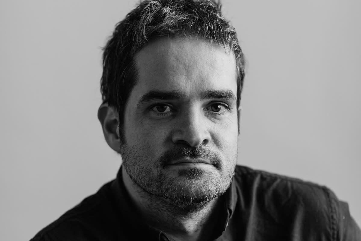
David Campbell is a senior designer at the Museum of Old and New Art (Mona) in Hobart, Australia. He has overseen design outputs across activities including Moorilla Winery, Moo Brew and Mona Foma; exhibition identities for the likes of Marina Abramović and Yannick Demmerle; and Mona books including Stories of O and The Red Queen.
Mona's core objective isn't to singularly delight its visitors — it's to disrupt, question, annoy them too. How might this anti-mission affect your design processes and outcomes?
I’m not sure if that’s how I’d define Mona’s core mission. I’m sure we’ve disrupted and annoyed people along the way, but that’s been a fringe benefit of the work we do, rather than a KPI. And Mona has definitely shown some artwork that is delightful and some that is disturbing, and some that is boring, and some that is the product of genius. Unlike most galleries, it’s generally left to the viewer to decide which one is which. Likewise with the design, there’s a belief in the subjectivity of the audience. For all I know, everyone might love our unreadably small fonts, ambiguous signage and jarring colour schemes.
But the overarching ethos has allowed for a degree of experimentation, and for design that some might see as more difficult. I’ve used colours designed to annoy, fonts that are really too clunky to be read, and played with the imagery using techniques that other galleries might find unacceptable, such as harsh cropping, theatrical lighting, laying text over images etc. Generally, artworks in museum collections are presented in a relatively straight, documentary style, in a clean white framework. While I often use this approach, I’ve also often presented artworks with a more subjective viewpoint, such as through a tiny detail shot or an unclear view across a darkened exhibition space. To me, it’s like the difference between medical photography and erotica. Pick a side.
Can you talk about some of the old and new research references you use and how they come together to form a body of work? I’m also interested in the intersection of how medieval design practices influence your digital work, and how technology affects traditional formats?
There are a few different theories about where serifs come from. One theory says that when the first stonemasons started carving letterforms into rock, the chisels would often chip away the stone in unanticipated ways. They found they could get a more reliable result if they started making a small curved groove into the surface before starting on the main lines of the letterform. Another theory says that the serifs come from the brushwork that was originally applied to the stone. The stonemasons were using the familiar forms of the brush to make the text more like what people were used to, and therefore more readable.
When the first typewriters were developed, they had problems with the typebars getting in the way of each other, so they made the keyboard as hard to use as possible, in order to force the person typing to press the keys as slowly as possible.
So I’m really aware of the fact that I’m writing this on a keyboard that designed to be as user-unfriendly as possible, in a typeface that was designed to work well when carved into rock.* It’s absurd, but once something becomes culturally ingrained, it tends to hang around.
For all I know, everyone might love our unreadably small fonts, ambiguous signage and jarring colour schemes.
David Campbell, Mona
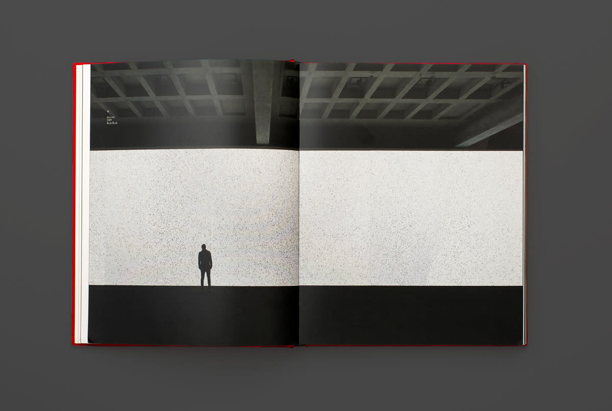
Design: The Red QueenDavid Walsh (the owner of Mona) has said something to the effect that in a hundred year’s time, the contemporary art that he has bought may be considered garbage, but statistically, there’s a far higher chance of the antiquities still being valued. He knows this because they’ve stood the test of time, so they’ve already proven they’ve got cultural resilience. I can’t be sure that the choices we’ve made as designers won’t look ridiculous in a week. But for now we can look pretty serious, because we’ve borrowed (read “stolen”) from other’s longevity.
We’ve used traditional styles due to their associations with voices of authority, such as the bible. Using these styles give a certain gravitas to the texts. When our writers are being serious or thoughtful, the design lends weight to this authority. And when our writers are saying ridiculously silly stuff, the po-faced delivery just allows the jokes to land all the harder.
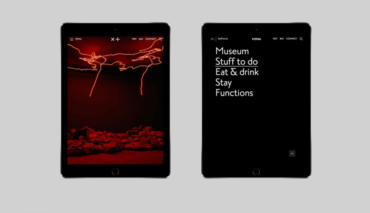
We do tend to juxtapose these styles pretty harshly with contemporary fonts and technologies. The combination and recombination of the old and the new gives us a really fertile area to explore, as well as aligning closely with the museum’s curatorial slant.
* For the type nerds reading this, I am aware that the Semi Permanent site uses a sans-serif font for the body text. I’m writing this in Caslon. If you don’t like it, bite me.
When creating work that is articulating the vision of an artist (whether it be a book, exhibition identity or otherwise), what do you see as the purpose? To please the viewer? The artist? The philosophy of the gallery itself?
Any artist who the curators have chosen already fits, in some form, into the philosophy of the gallery. The challenge is to find a common visual language between what we do and the artist’s concepts. If a finished work looks something true to both the artist’s work, and to the look of Mona, it’s a good result. It’s almost as if we’re ultimately trying to please the concept itself. If we find it really interesting, we usually find it’s really interesting for our audience as well.

As a conduit between the artist and viewer, you then have the power to create new entities within your design — though this may add or detract from the art itself. How do you know the limitations in order to remain true to an artist intent? Or perhaps that doesn’t matter and you can do whatever you want?
Designers shouldn’t make art (at least, not in their day jobs). They can present it, mirror it, oppose it, and even respectfully mess with it. But the moment you find yourself generating graphics which look like a new artwork from the artist you’re showing, it becomes pretty disrespectful to the artist.
That said, I’m also not a big believer in staying true to the artist’s intent. The goals of art and design aren’t actually the same. It’s important to research and know the visual field you’re working in so that you are presenting the work appropriately, but the design still needs to present it in a way that aligns with the values of the gallery. Working directly with the artist helps the process greatly. Designers and artists have a shared language, and if they understand what we’re doing, they’re mostly very supportive. It can be quite fun – I have fond memories of turning up at an opening shortly after the catalogue arrived, and having the artist run across the room and hug me.
Sometimes creating for an exhibition involves generating a whole new visual entity. Sometimes the role is about finding and drawing out a tendency in their work. Other times, the artist and the artwork need no help whatsoever, and you do your job best by just getting the hell out of the way.
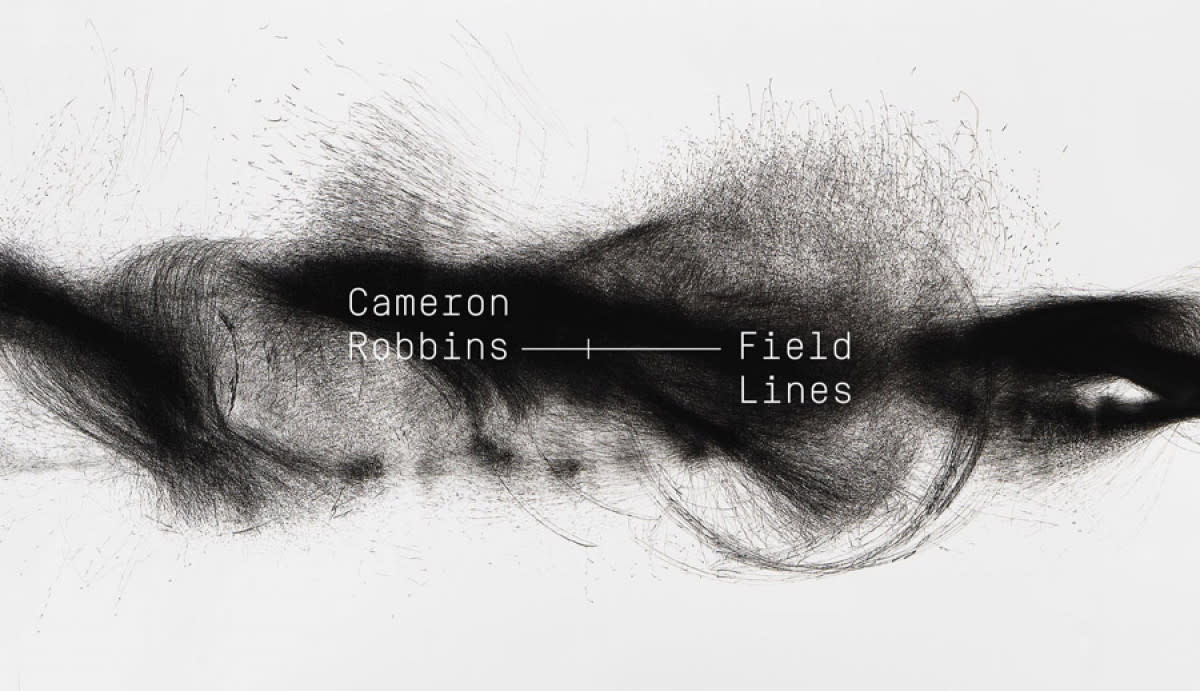
To what extent is consistency important to you?
Consistency is important, but just so long as you use a broad enough definition of the term. We have a few elements we use: our in-house font, our logo, and a few colours. It’s a strong suite of stuff to pull from, and I love the challenge of revisiting and trying to remake stuff afresh with the same elements. We also create a lot of new identities for all our major exhibitions and festivals. But I really like the idea of a design consistency that’s more of an attitude. I love the idea that you could pull a page out of one of my publications, and without the title, the logo, and the font, it would still look like a Mona publication just by the attitude.
There’s a been a lot of work and thought gone into the visual stylings of our separate projects, and they can, at first, look pretty diverse. Once a viewer has engaged with what we’re doing more, they start to see a consistency. Dolly Parton once said “It costs a lot of money to look this cheap”. Maybe we could paraphrase this, and say it takes a lot of rigour to make it looks like anything goes.
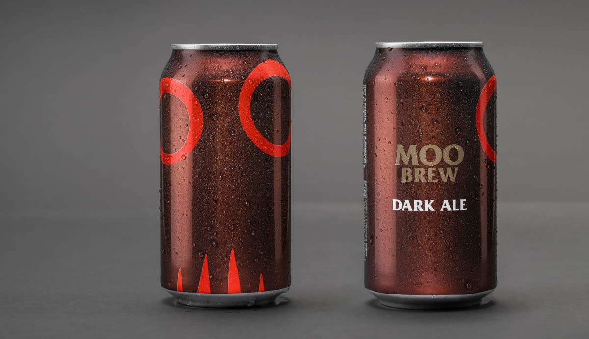
I once read that Amazon named their AI bot Alexa after the Library of Alexandria, which says a lot about their ambition for unilateral knowledge. I feel that Mona has a similar, albeit more public ambition for continuously expanding education. So my question is, how do you design for knowledge?
The first thing I try to avoid is simplicity, at least in the way it’s defined in today’s design-speak. It always reminds me of elevator music. You know, when they get a song with a measure of power or grit or sexiness, then strip out whatever makes it unique, play the melody on a synth keyboard, and make it into something that can’t offend anyone as they ride between floors.
I like to focus more on clarity. To extend the elevator music metaphor, this could mean adding lots of extra speakers into the lift, pumping up the volume, turning off the lights, and adding in mood lighting. Have a vodka shot. Maybe it wouldn’t make for a great elevator ride to your office... but maybe it would. It would definitely be a more interesting start to the day. And it does a much better service to the music.
Complex information requires complex solutions. As a designer, there’s a lot you can do to encourage engagement, like clear hierarchies and suitable pacing, but it also requires tenacity and effort from the reader. I’d recommend any designer out there read Edward Tufte’s book The Visual Display of Quantitative Information. Its title is magnificently boring, but the content is killer if you’re into that sort of thing.
Also, didn’t the Library of Alexandria get destroyed? I’m not sure if that’s a particularly auspicious name.
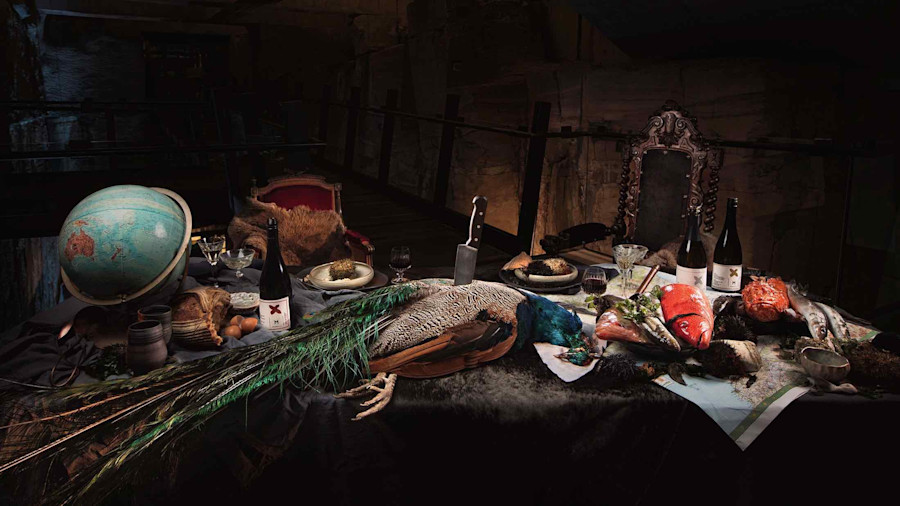
Feature Image: Moorilla Cloth Label series. David Campbell, Charlotte Bell, Robbie Brammall, Danielle Gibson and Jesse Hunniford