Speaking of fictions – a conversation with Erik Brandt
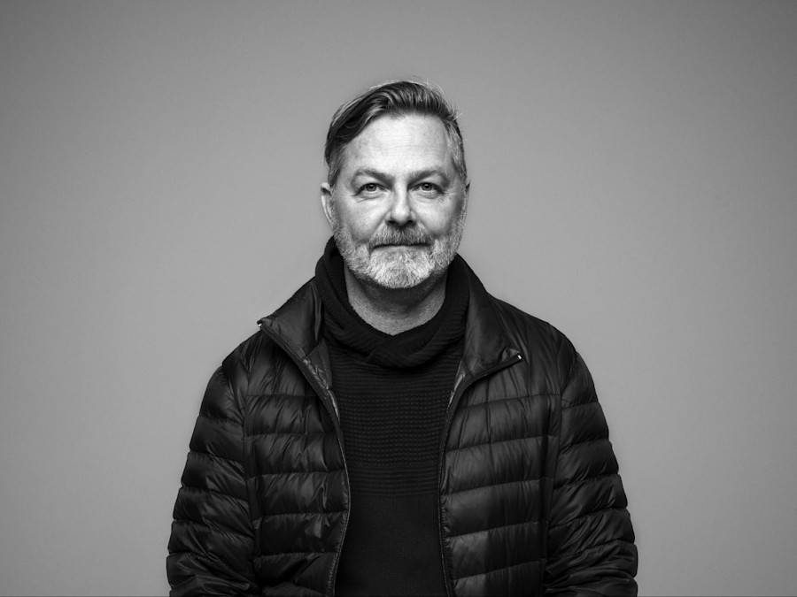
Erik Brandt is the proprietor of a small Minneapolis graphic design studio called Typografika – Visual Communication und Konditorei (more on that later). Minneapolis, for those unfamiliar with the city, is built on the banks of the Mississippi and buts up against St Paul, the other half of the Twin Cities. Minneapolis is famous for many things, the careers of Prince and Bob Dylan took off there, there’s a significant Lutheran church designed by Eliel and Ero Saarinen, and plent of other interesting architecture, including the Walker Art Center, a large modern art museum with an extension by Swiss architects Herzog & de Meuron.
“In the American design scene,” says Brandt in response to a question about how he ended up there, “Minneapolis was sort of like our Amsterdam.”
“In the mid-90s, Scott Makela and Laurie Haycock Makela were running the Walker and commissioning amazing typefaces from Matthew Carter. A lot of the work that was coming out of here was really fascinating. You remember, in those days, you couldn’t get your hands on contemporary work except every other month or maybe twice a year when Émigré came out, or what have you. For me it always had this fascination and MCAD specifically, I knew of the school as a good little school, so when a position became open I was really keen. Luckily they offered me a job, and we moved here.”
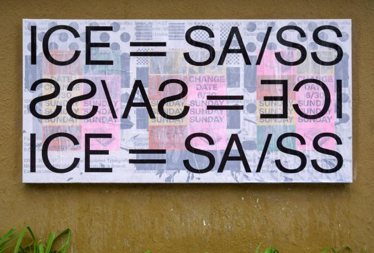
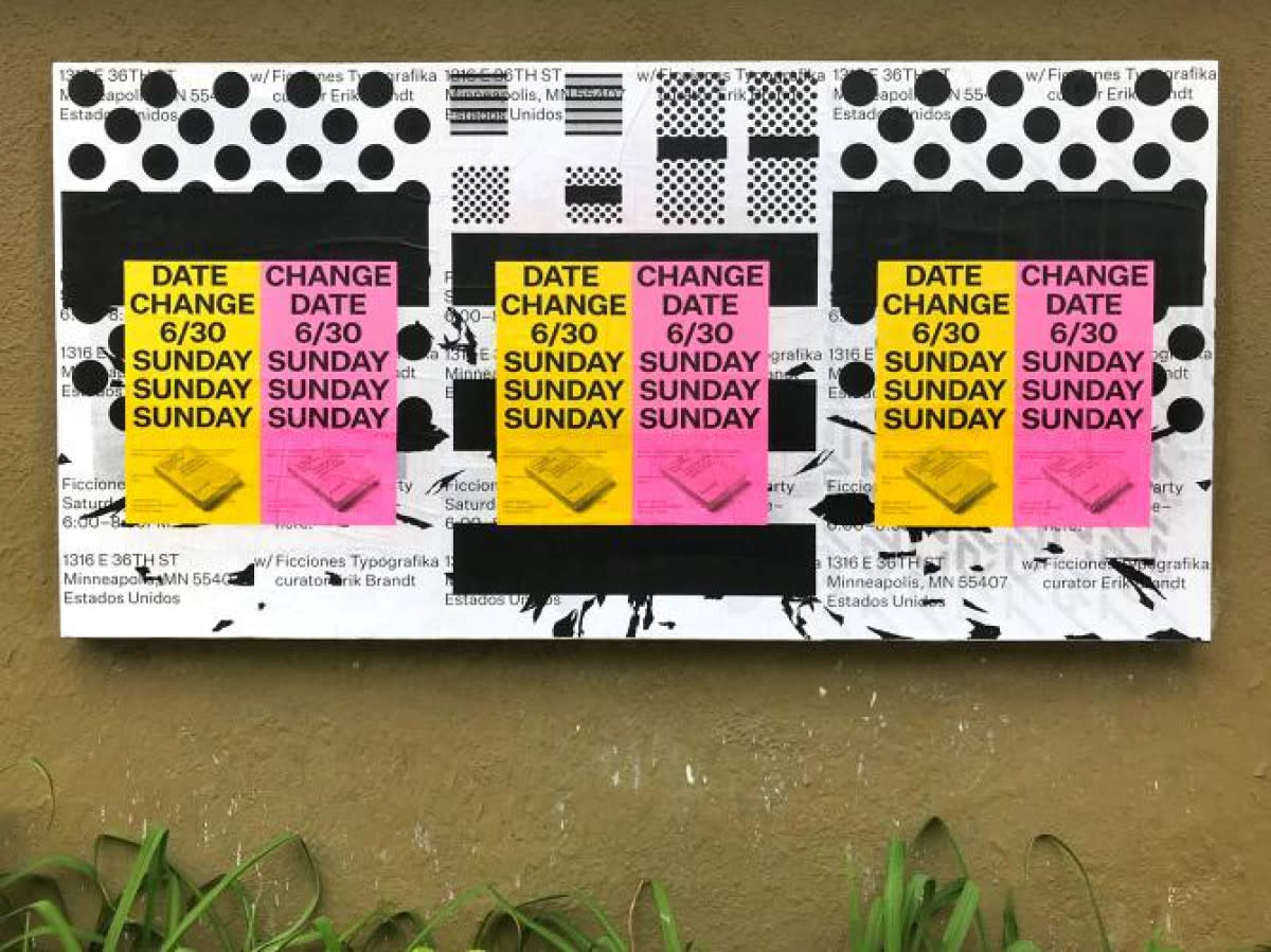
Since 2015, Brandt has been chair of design at MCAD (Minneapolis College of Art and Design) as well as professor of graphic design. He’s also been undertaking self-initiated projects that connect his Minneapolis neighbourhood of Powderhorn Park to the world (and vice versa) – notably, Ficciones Typografika, a project dedicated to “typographic exploration in a public space” that saw the designer hanging posters on a cedar display board attached to his garage wall for a five-year period. In total, 1641 posters went up; Brandt designed some; most were designed by established and up-and-coming designers from all around the world. The posters have just been published by Formist Editions as a collection, Ficciones Typografika 1642 (the book is the final Ficcione, hence 1642)
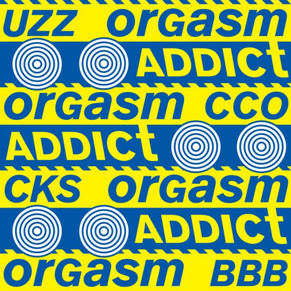
"Brandt’s typographic works sometimes feature a dazzling array of elemental shapes, squares, circles, triangles, and a dazzling array of bold colours. And sometimes not. For instance, ‘Emma Lazarus 1883’ – one of Brandt’s own Ficciones – saw the sonnet The New Colossus set in a lower case sans serif, with italics and indentation subtly emphasising the gulf between past and present U.S. attitudes to immigration. The poem was originally written to raise money for a pedestal for the Statue of Liberty, and features these well-known lines: “Give me your tired, your poor, your huddled masses yearning to breathe free”, which is a far cry from more recent American political rhetoric, for example, “I will build a great, great wall on our southern border…”.
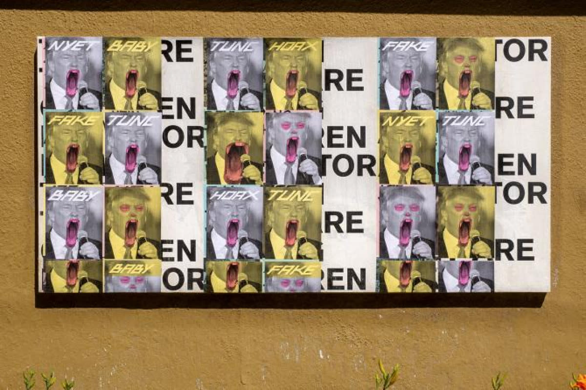
Keenly interested in type and typography, Brandt is also deeply interested in the meaning of words and their political power. He says his initial connection with graphic design came from studying history and from the languages he grew up with as his family moved from America to Malawi, Cameroon, Germany and Egypt.
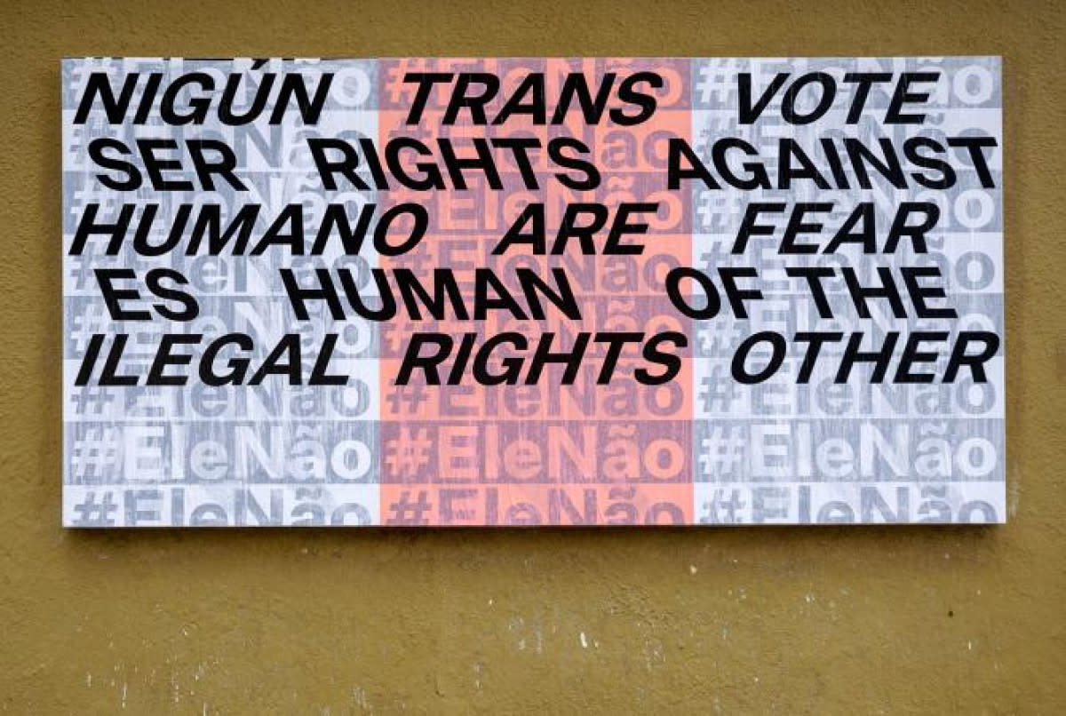
“I didn’t live in the United States until I came back for university. I’d grown up speaking a number of different languages, so language and words, writing and stories are central to my work and are really the way I start working. It’s always through an investigation of key concepts, or words or phrases that seem important. It’s relatively predictable in that respect.”
Erik Brandt – Q&A
Hi Erik, how are you – is that your office there?
Well, no, this is my luxurious basement studio.
It looks well-loved.
Well cheers! I used to really love it down here, but my two little girls have grown up more so they’re usually running over my head.
Have you been to Auckland before?
I haven’t, it’s been my life-long dream actually, to visit New Zealand. I’m so excited about this.
Life-long dream? Surely you jest…
Actually, it’s really funny. My father is German, I grew up in northern Germany, you know, this is in the ’70s, and we were about 15 minutes away from the East German border. My friends and I used to joke and calculate how long it would take the T-72s [tanks] to come over the border and get to us. We would always say, well, in a nuclear war New Zealand’s the place to be.
It’s probably still the place to be, especially if you’re a US millionaire looking for a bolthole. Erik, I see you have a book called Ficciones Typografika [Formist Editions, 2019] coming out at the end of the month…
Yes, it’s already out. I’m going to do a book-release party in New York City at the end of the month. I’m also going to have a couple of events here locally, and then we’ll see. From what I understand, I think we’ll be able to sell a few books at Semi Permanent as well, which will be good.
Yes, you will – we love books here. I’d say brace yourself for long queues and bring a spare pen for autographs.
I can’t wait.
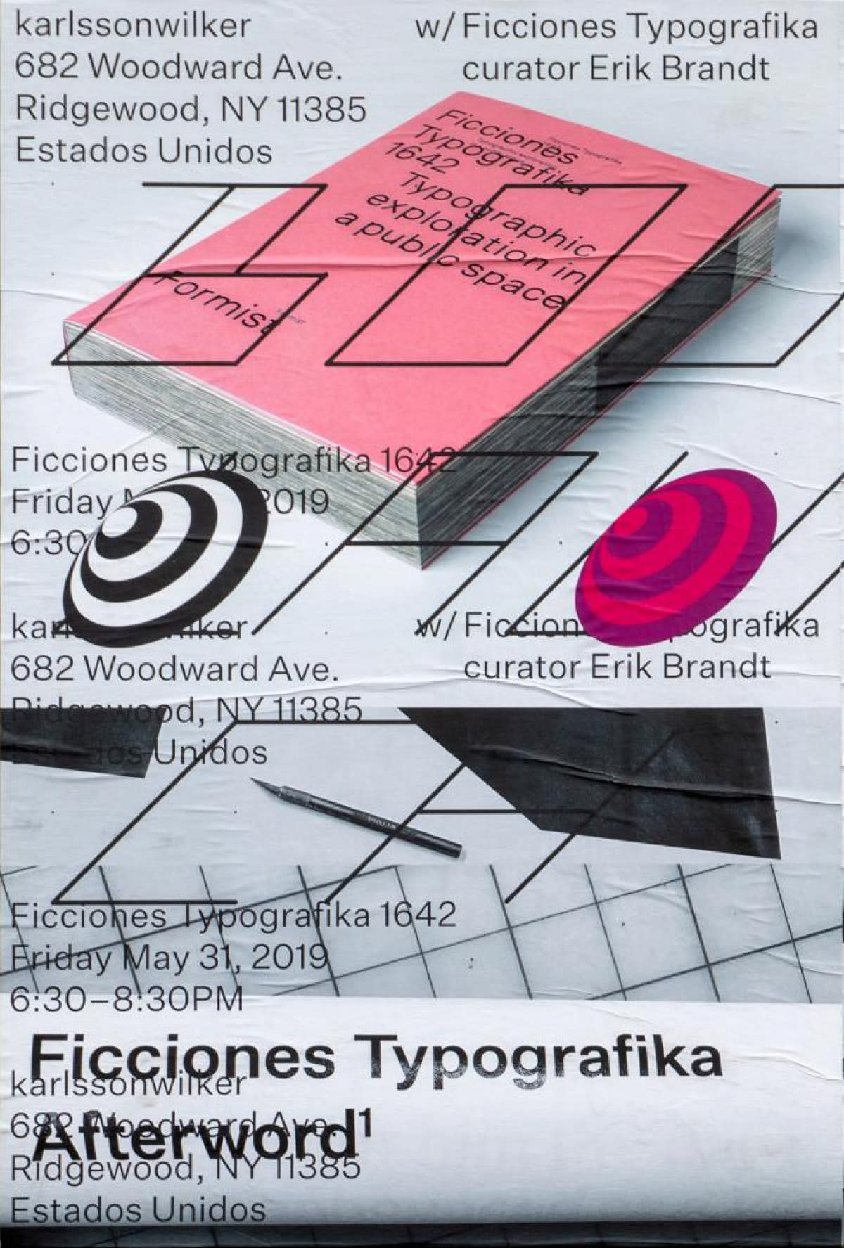
Speaking of Ficciones, I enjoyed reading the ‘afterword’ from the book that you’ve generously posted on your website. From that I deduce that you came to design later in life…
Yes, very much later. I was living in Japan and got involved with a magazine there, just as a writer at first, and I was drawing a comic for them. I worked my way up to the editor’s position. I didn’t study design in earnest until some years later, when I finally figured out that it was what I wanted to do. I was lucky enough to get into a graduate programme. I think they thought I would be the oddball in the group, so they let me in…I think I proved them right, somehow.
I think it’s quite good to take some life experience into a career; to not make a decision about what you’ll do until you’ve lived a little...
I couldn’t agree more. Speaking as a teacher – more and more, especially here in the United States, there’s a lot of pressure to go to college right after high school. It feels like the students are getting younger and younger – and they are, because I’m getting older and older. They’re always the same age of course, but it sometimes seems like they’re not really ready to embrace a career. It’s not fair to them, I think.
In the book’s afterword I was impressed by the philosophical overlay you impress upon your time as cycle courier in Washington D.C. I’m impressed that you survived.
The last time I got hit was by an F150… a big kind of truck.
That’s a big unit.
I was lucky. I had friends who weren’t so lucky and got hurt really badly. I raced bikes at the time and had the worst crashes. But it was a fantastic job, a complete blast. I wrote about some of the odd encounters…
Yes, I liked your description of Robert McNamara [U.S. Secretary of Defense, 1961–1968]: “…one day on 16th and K Street, coming across the forlorn figure of an elderly gentleman replete with horned rimmed spectacles, hat, standard issue trench coat, and the brown brogues of a K Street lobbyist...”
Yeah, It took me a while to recognise him. I was frozen still. There are plenty of other stories, many that can’t be written about, necessarily.
Maybe save those for the post-talk conversation.
I remember picking up a Kevlar jacket, a bullet-proof vest from this guy. More often than not I think we delivered things that you were not supposed to be delivering. Various illicit items. It was fun, great people, very eclectic, especially over the winter, because you’re just left with the people who are doing it all the time. In summer there would be a lot of kids coming into town, and they would sort of take work away, but you had to build up your relationship with your dispatcher and stuff like that.
Here’s a question for you Erik, your studio is Typografika – Visual Communication und Konditorei. What is a konditorei?
Oh, konditorei; it’s a confectionary. My grandfather in Germany was a baker, although konditorei can be separate from a bakery. It’s the finer, sugary things. Some time ago I started adding that to my studio name. It’s kind of an obscure joke, I suppose. I’m really pleased that you brought that up. You are now the second person that’s ever asked me what that means! The other guy was in England, and he laughed himself silly, because he was also German.
Do you do any baking? Or is it a red herring?
A lot of my interests are typography and typographic work, and I bake them into colours, so I always thought it was kind of perfect, actually, sort of a way of extending the idea of graphic design. I had a Japanese teacher and he used to talk about design in that way, not as a matter of ‘taste’ but literally ‘tasty’. That’s they way he thought and talked about it… ‘why would you eat something that looked like that?’ It was a strange way of talking, I loved that man, dearly.
It sounds like graphic design umami. Let’s talk more about Ficciones. It was an ever-changing exhibition of posters on your garage wall, right? How did it start?
I used to write a blog called Geotypografika. When I started it, it was really just for my students, so I could introduce them to work from all round the world. Then I realised that other people were reading it; it was getting bigger, people were following it, et cetera. It eventually came to an end and Ficciones kind of naturally grew out of that. I was due a sabbatical, and I’d been toying with this idea of building this board that I could experiment with my own work on.
One summer I thought, all right, I’m going to do this, so I built this cedar board on the side of my garage. It then occurred to me that it might not just be my own thing, that I should start inviting people from all over the world to contribute posters. I thought it would be successful for two reasons: I didn’t think there was anything really similar going on and it was a strange thing – a thing that shouldn’t be there.
I started inviting people, individually at first, curating the work, and then a friend of mine, a type designer in France, really encouraged me to just open it up. I was a little nervous about that because I didn’t want to be the person who said ‘no’ when the submissions came. But the seeding that took place really set a high standard and when submissions did start coming the standard just kept increasing. I really didn’t say no although sometimes I would put things aside – some people literally waited for five years for their piece to go up.
So, you pasted them up, right, how often were you doing it?
At the beginning it was about once a week. In 2014, if you can believe this, and I figured it out when [editor] Mark Gowing and I were working on the book, I was hanging almost every day. I was definitely neglecting work and family. I still don’t know how I did that because it’s so hard to remember doing it, especially in the winter, you know, days here are very short. I found it best to hang early in the morning and shoot with a little bit of light later in the afternoon. Toward the end, the last couple of years, I was hanging once a week or every two weeks. I found a good rhythm that seemed to keep up with the submissions, that seemed to work out really well. I think the coldest I ever hung, in Celsius, was minus 40. We’d paste them up, I’d cook the wheat paste up on the stove and paste them up, in rain, snow, sun, summer and winter.
Wow, that’s a commitment.
Yeah, Well, I figured out a trick to add windshield wiper fluid to the hot wheat paste, and then later someone told me that you should let it cool, because it’s just like for ice hockey rinks, they use hot water to smooth it out. I thought, aw man, you’re right, and I should have studied chemistry too. But Ficciones really took off. It gathered this global audience as well as this global participation and it was just fantastic, I loved every minute of it.
It must have been great for the neighbourhood to have an ever-changing backdrop.
It really was, people changed the way they walked their dogs, rode their bikes to work, the way they commuted in general. They’d stop by and talk about it. In the beginning, a lot of people thought it was all my work, then as a result of conversation they’d discover that it was coming from all over, that this one was a crazy brilliant young Iranian guy that I know, and that brought a lot of joy. When I ended the project, or I had to take the board down to repair it, I had angry people stopping by to say you can’t stop this project, it’s part of our neighbourhood.
Is the real legacy of Ficciones a crushing blow to local real estate prices?
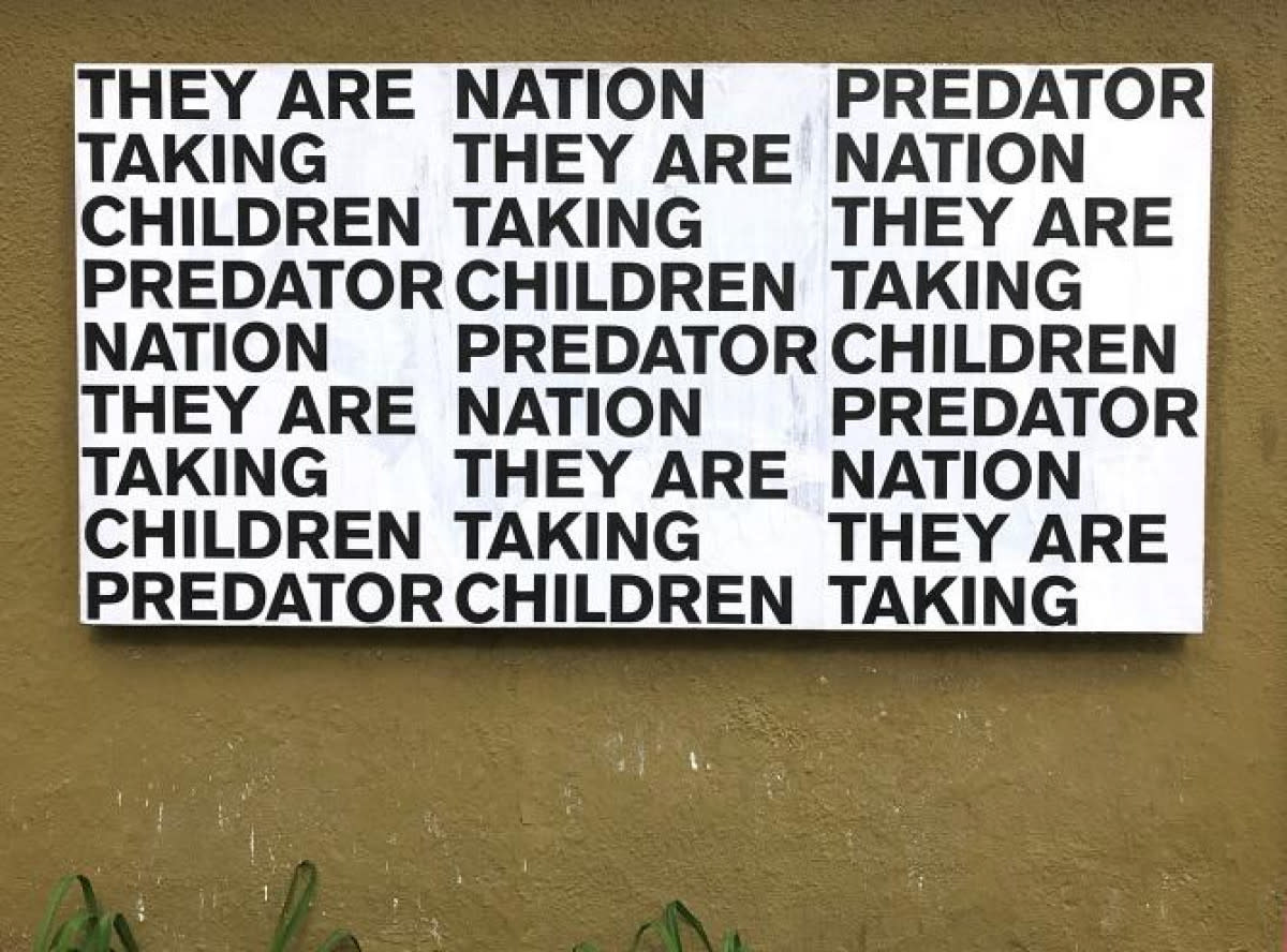
That’s my wife’s concern lately, because the succeeding project, [Typografika Politika] that I’m doing is more politically oriented, for obvious reasons, given the climate we’re living in.
No shortage of subject matter?
There’s plenty of subject matter – it’s a project that has definitely brought some anger from so-called Trump people. The last piece I had up was torn down, but wheat paste makes the poster quite hard and I think it must have inflicted the worst papercut of all time. There was blood everywhere – Ficciones bites back.
What’s in the book? Is it a compilation of every poster hung?
The book is the entire project. When Mark and I first started talking about it, we weren’t sure how much we could do. It was Mark’s decision to go for it; to commit to whole thing. It took us some time to get everybody’s permission. Mark was concerned about being a third-party publisher. People are still writing me, asking if their work is featured. I don’t know how many times I’ve said the entire project is featured, every single piece, 1,641 posters. Holding the book gives you a real sense of the scale of the project; even for me it seems overwhelming, you know, I hung all those posters, and worse, I cut them all down. It’s still kind of staggering to me.
Will Typografika Politica become a series like Ficciones?
Yes. It’s pretty much a logical outcome because the posters that I did for Ficciones were invariably political. It feels natural for me to continue that way but at a much slower pace. I’ve also found – and there’s a great word in German, a really long word, politikverdrossenheit, which means political disillusionment – that’s definitely a sensation a lot of people around here are feeling. There’s so much daily outrage, it’s sometimes hard to find that one thing that needs to be put down, because you could just be making things constantly.
You’re a typographer but you are clearly interested not just in how words look but what they mean. Is it your interest in politics and journalism that feeds this?
The initial connection that I found to graphic design came from studying history and is really language based. I was born in America but my family left almost immediately and lived in Malawi in Africa, and Cameroon, and then Germany, and then Egypt. I didn’t live in the United States until I came back for university. I’d grown up speaking a number of different languages, so language and words, writing and stories are central to my work and are really the way I start working. It’s always through an investigation of key concepts, or words or phrases that seem important. It’s relatively predictable.